Greenville Chamber of Commerce Rebrand
The Greenville Chamber of Commerce rebrand is designed to honor it’s rich history while presenting a professional, accessible, and dynamic identity
What is the Greenville Chamber of Commerce?
History
Founded on March 1, 1924, and incorporated in 1947, the Greenville Chamber of Commerce has served Greenville and Montcalm County for over a century as the county’s only fully staffed chamber, dedicated to promoting economic growth, community vitality, and collaboration.
Mission
The Chamber’s mission is to build a vibrant local economy through investment, advocacy, promotion, and education in partnership with its members. Rooted in inclusivity, collaboration, and service, it aims to strengthen its structure, adapt to business trends, provide member education, and fully utilize its building as a community asset.
Audience
The Chamber’s core members are established local professionals ages 40–65 in industries like retail, services, healthcare, manufacturing, and nonprofits, valuing tradition, networking, and community presence. Its growing secondary audience, professionals and entrepreneurs ages 25–40 in creative and digital fields, seeks modern networking, growth, and digital engagement.
Current Visual Identity
My analysis is that the Greenville Area Chamber of Commerce has a strong legacy, is well respected locally, and runs popular, community-centered events, but its visual identity and messaging are fragmented and often feel cold or unprofessional due to inconsistent typography, colors, logos, and imagery. Digital touchpoints are uneven, unverified, and visually disjointed, which weakens trust and makes it harder for new audiences to engage.
Key recommendations focus on standardizing type and color, refining and consistently applying the logo and slogans, unifying iconography and photography to feel warm and inviting, consolidating and actively managing social channels, and establishing clear brand guidelines to maintain accessible, professional design across all materials.
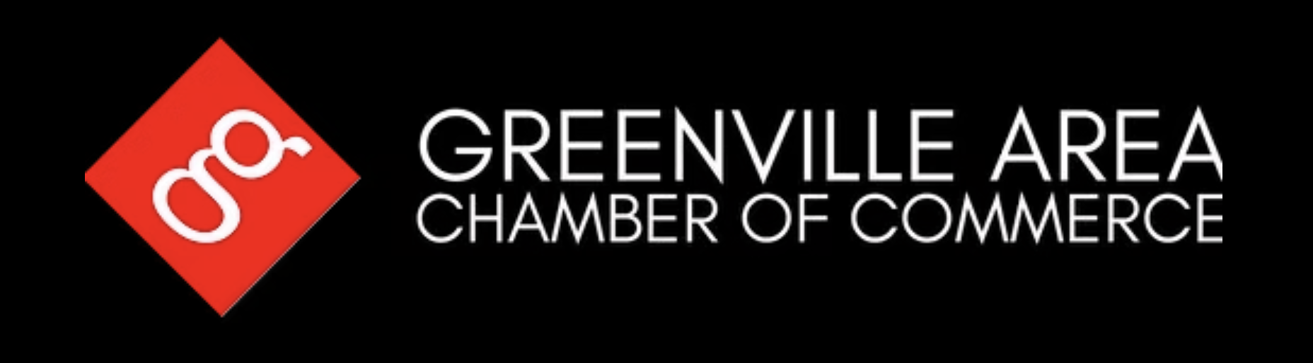
Logos
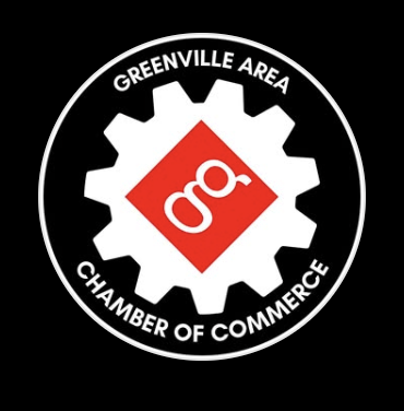
Icons
Social Media
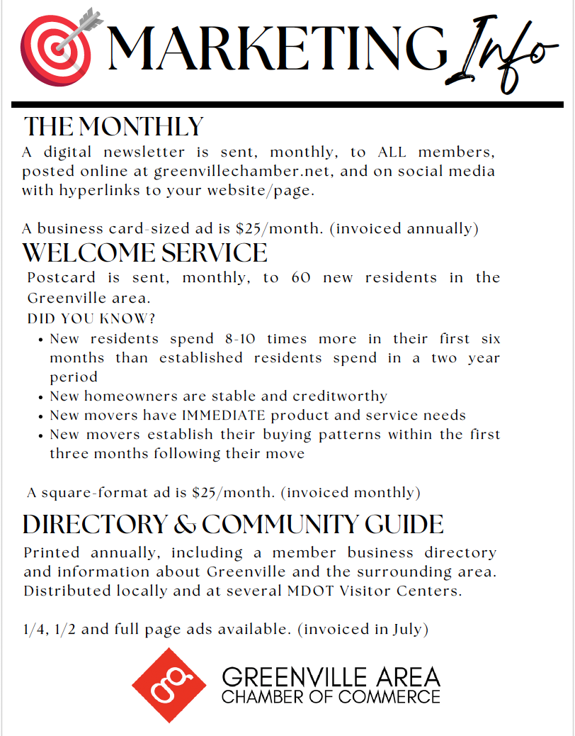
Print Media
Color Palette
Research Methods
-
The brand audit reveals a nearly century-old organization with strong local equity but a fragmented visual system that undermines that trust. Across print, digital, and environmental touchpoints, typography, color, iconography, and photography vary widely, leading to legibility issues and a cold, inconsistent look that does not match the Chamber’s warm, community-centered mission. Social media and some print materials repeat these problems through mismatched layouts, multiple slogans, and unverified profiles, signaling an urgent need for unified guidelines and more accessible, professional execution.
-
The personas of Sarah Thompson and John Miller show two core audiences—retail entrepreneur and manufacturing owner—who value deep local relationships, practical education, and visible advocacy. Both are time-poor small business leaders who rely on the Chamber for credible networking, policy support, and skills development, but who also struggle with regulations, staffing, and staying current with best practices. Their needs highlight opportunities for clearer, benefit-led communication, more accessible learning formats, and branding that feels as reliable and human as the in-person experiences they already appreciate.
-
The competitor analysis positions digital platforms like LinkedIn and regional groups such as the Grand Haven Chamber as credible alternatives for networking, visibility, and education. LinkedIn offers scalable, always-on networking and learning but lacks local specificity and in-person community, while Grand Haven delivers robust programs and marketing reach that could tempt Greenville members seeking broader exposure. These comparisons underline the need for Greenville’s Chamber to modernize its digital presence, clarify its unique community-driven value, and elevate benefits and programming so members see it as both locally essential and competitively current.
Research findings show strong community trust, brand inconsistency, and digital opportunity.
This research shows that the Greenville Area Chamber of Commerce is a long-standing, trusted local advocate that drives networking, events, and economic growth for small and mid-sized businesses, with strong appreciation for its accessibility, community impact, and member support. However, its brand expression lags behind its reputation: visuals, typography, color, and social media execution are inconsistent and sometimes cold, making it harder for core personas like Sarah Thompson and John Miller to recognize official content, feel emotionally connected, and clearly see the Chamber’s unique value versus digital-first platforms like LinkedIn and regional competitors such as the Grand Haven Chamber.
Goals of the Rebrand
01
Build trust and recognition with consistent, professional visuals and unified messaging that reflect the Chamber’s credibility and tradition.
02
Strengthen the Chamber’s ability to connect people and promote events with clear communications that people recognize and value locally.
03
Address confusion and lack of engagement caused by mismatched logos, fonts, colors, and uneven presence across digital channels
04
Create a warmer, more inviting atmosphere to increase community participation and improve accessibility for all audiences.
The Results
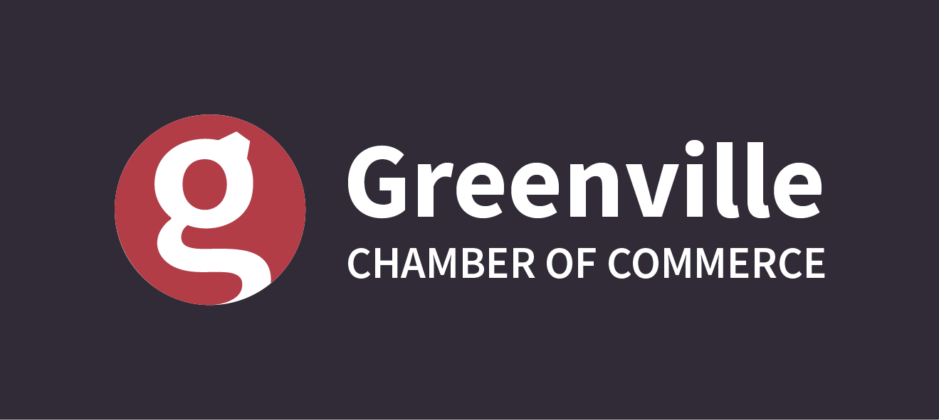
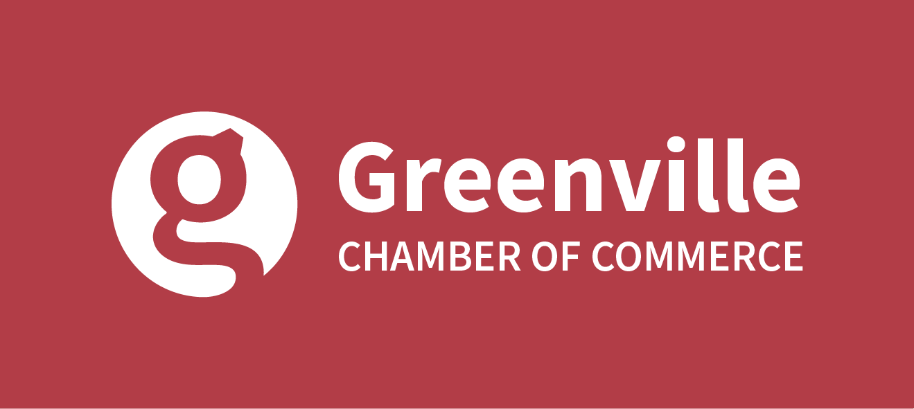
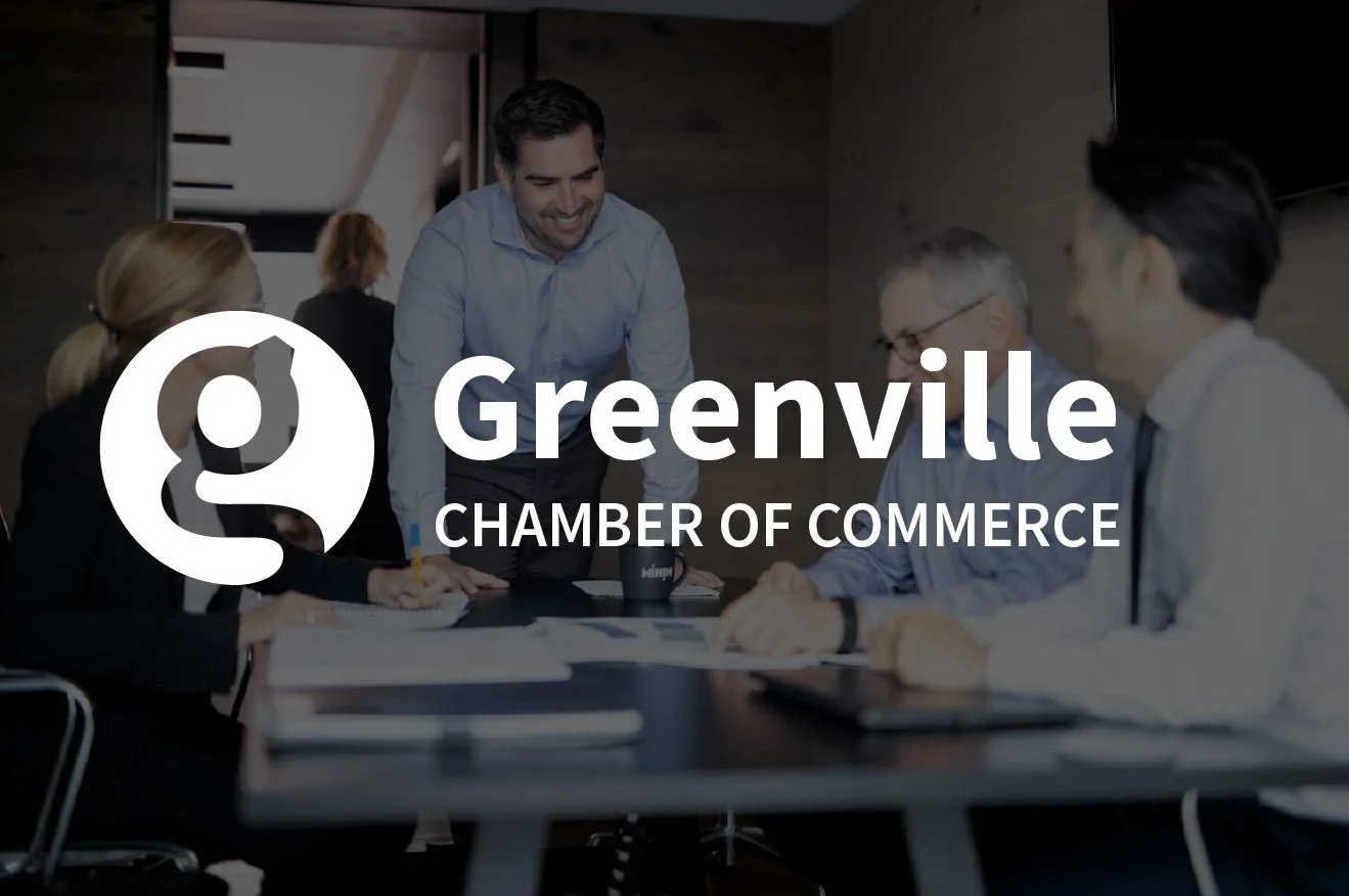
Logo
A streamlined logo was created to serve as a consistent primary mark. The logo now features the Greenville ‘g’ within a balanced icon paired with a clean wordmark. Variations include vertical, photo, dark, and one-color versions for adaptable use across media.
Variations
Icon
Primary Mark
Word Mark

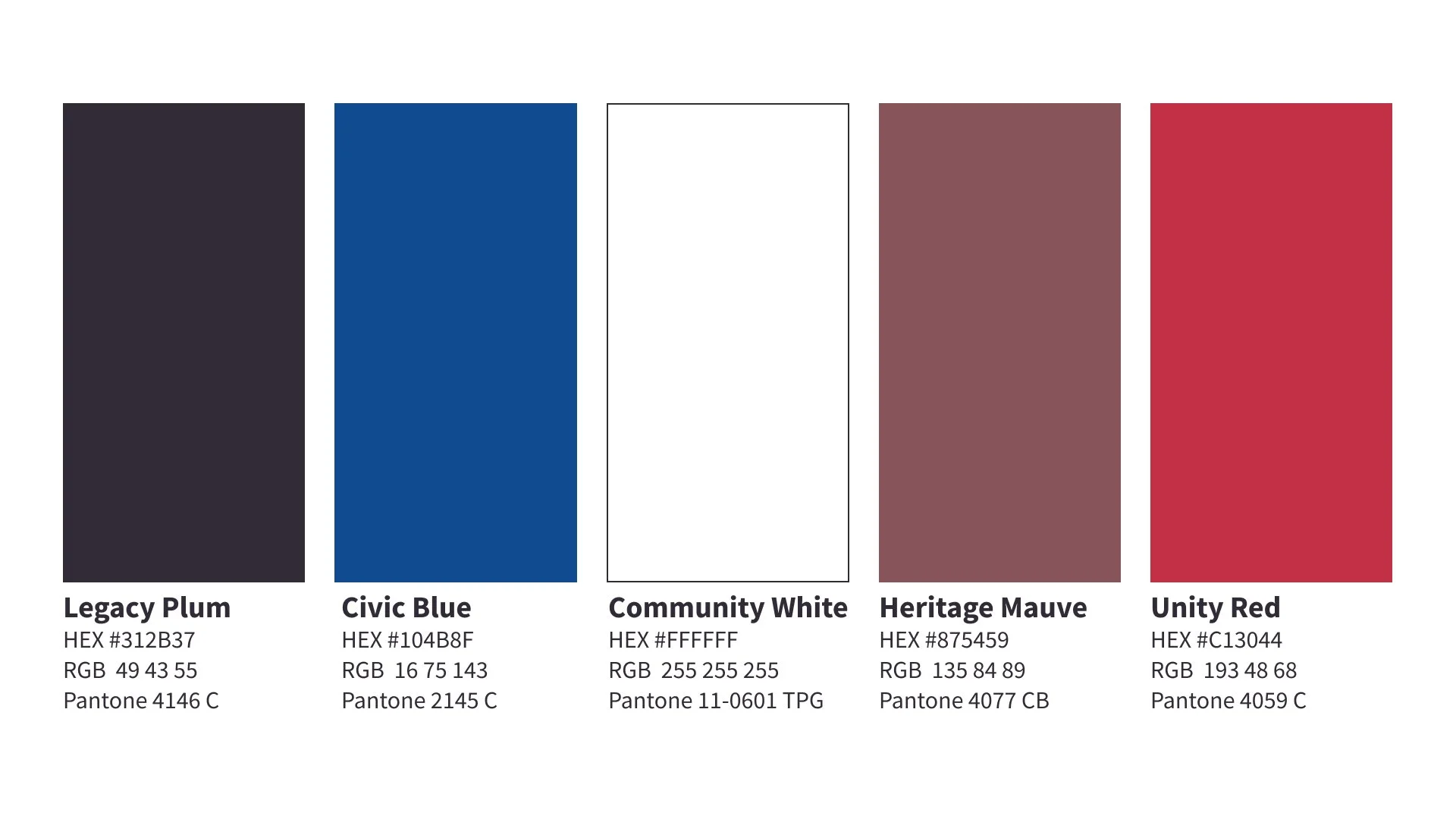
Color
The color palette was expanded to align with brand values and position the chamber for a dynamic future.
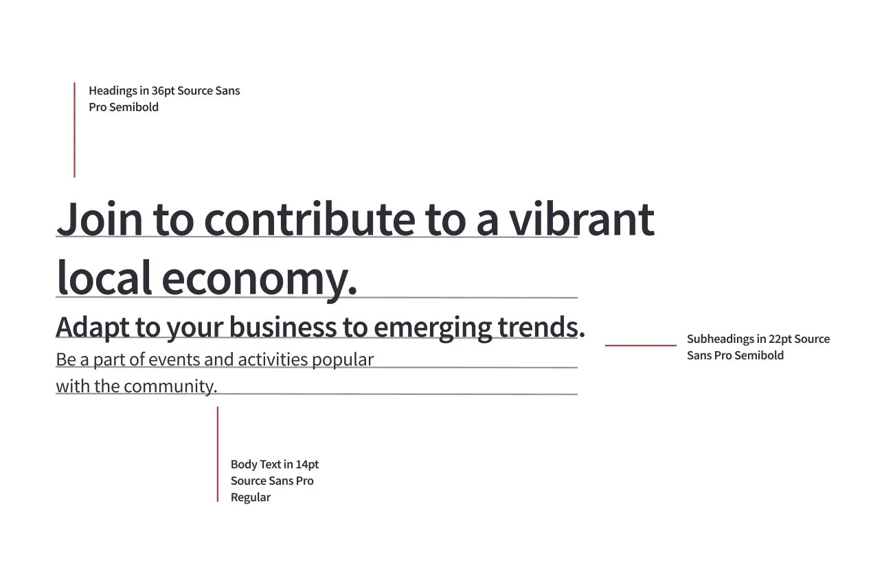
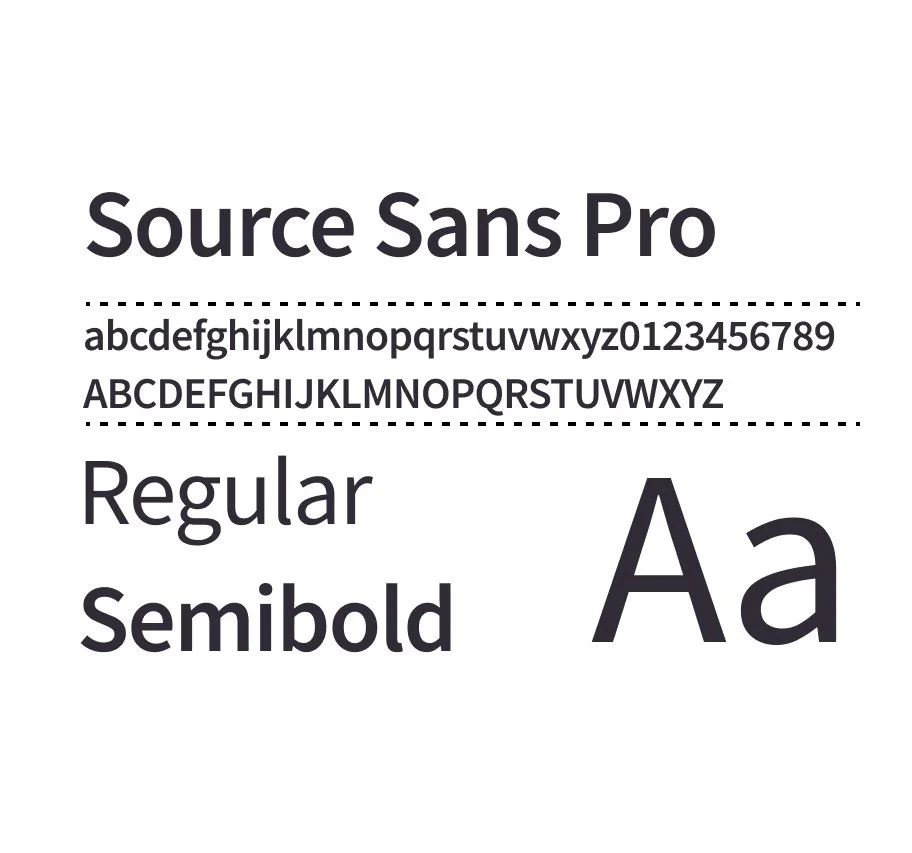
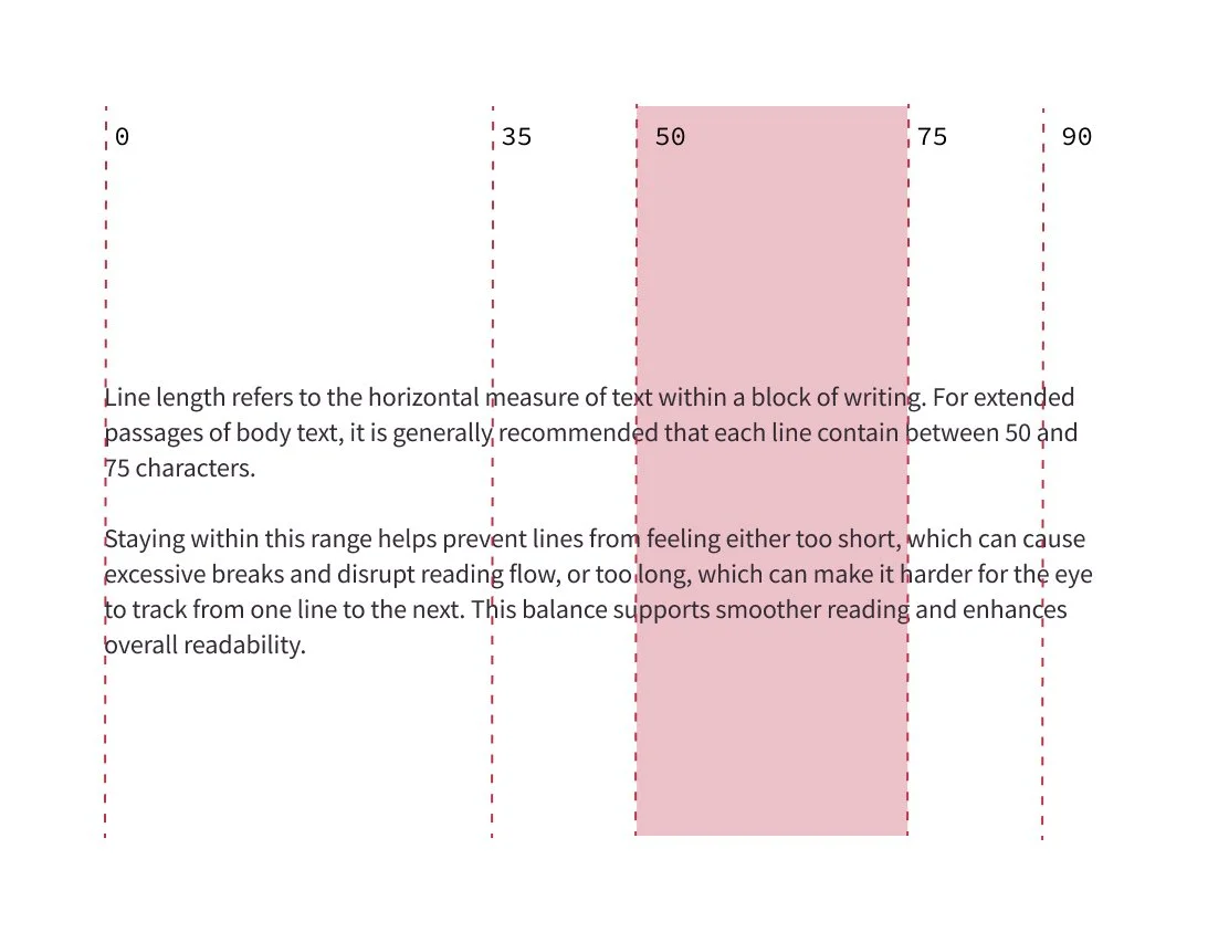
Type
Typography was also standardized using Source Sans Pro across all materials to enhance readability and professionalism. Text hierarchy, sizes, and line length are clearly defined to support smooth reading and accessibility. These choices address previous inconsistencies and create a unified, welcoming brand presence that resonates across all touchpoints.
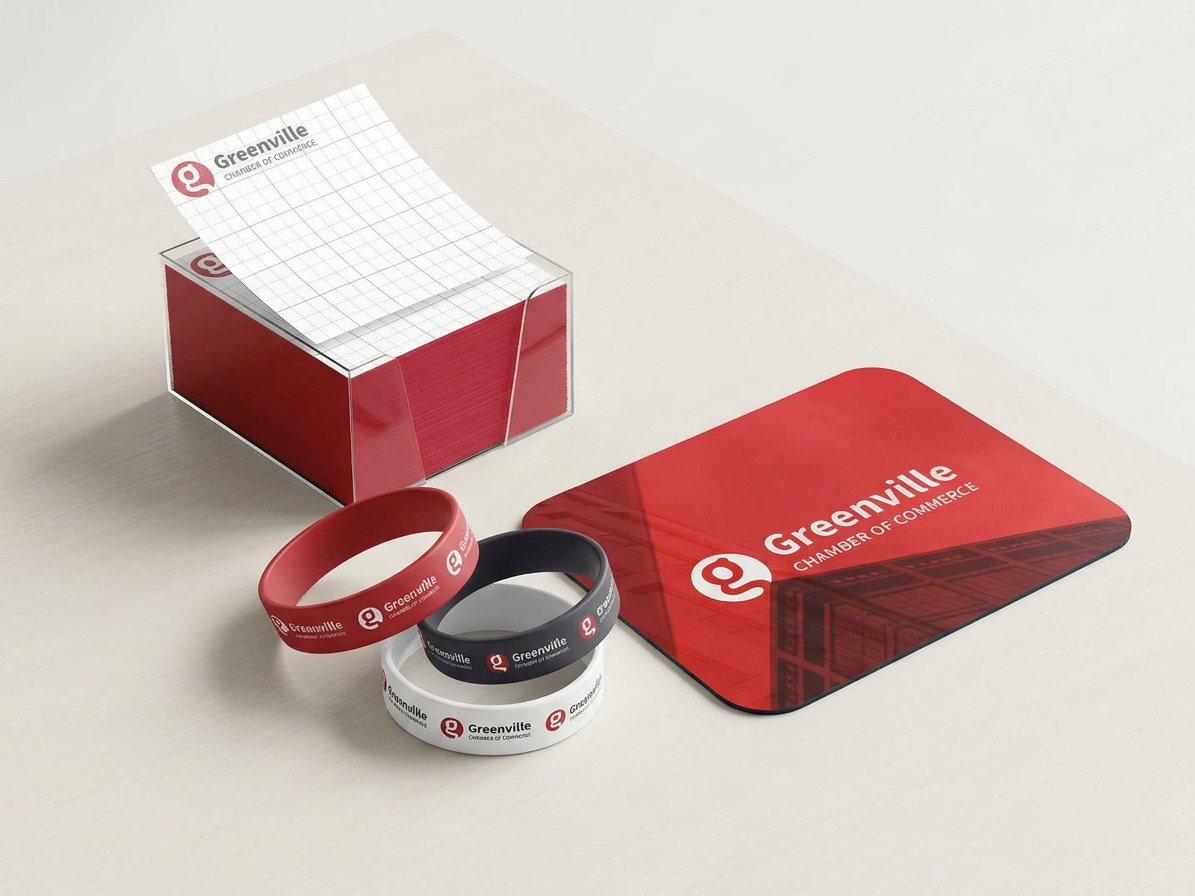
Promotional Merchandise
This project extends the Greenville Chamber of Commerce brand into a cohesive set of promotional touch-points, including a memo cube, wristbands, and a mousepad. The goal was to create consistent, high‑visibility collateral that reinforces brand recognition in both office and event settings. Strong use of the chamber’s core color palette, logo mark, and clean typography ensures each item feels unified while functioning as a practical, take‑home reminder of the organization.
Applied Motion Campaign
The brand was brought to life through a dynamic motion campaign that showcased the new visual assets and messaging system. The original gear motif reappears at the beginning, bridging the past and present, before the logo begins to build itself from the ground up—symbolizing the journey of small business owners. As the animation unfolds, the tail of the “g” is clipped, revealing a final icon that references one of their core services: ribbon cutting. The motion then transitions into a complementary sequence of b-roll footage and taglines that celebrate the community at the heart of the brand. The logo closes the piece with a handshake-inspired movement, leaving a lasting impression and sense of connection.
Thank you for viewing.