Atomic Heat
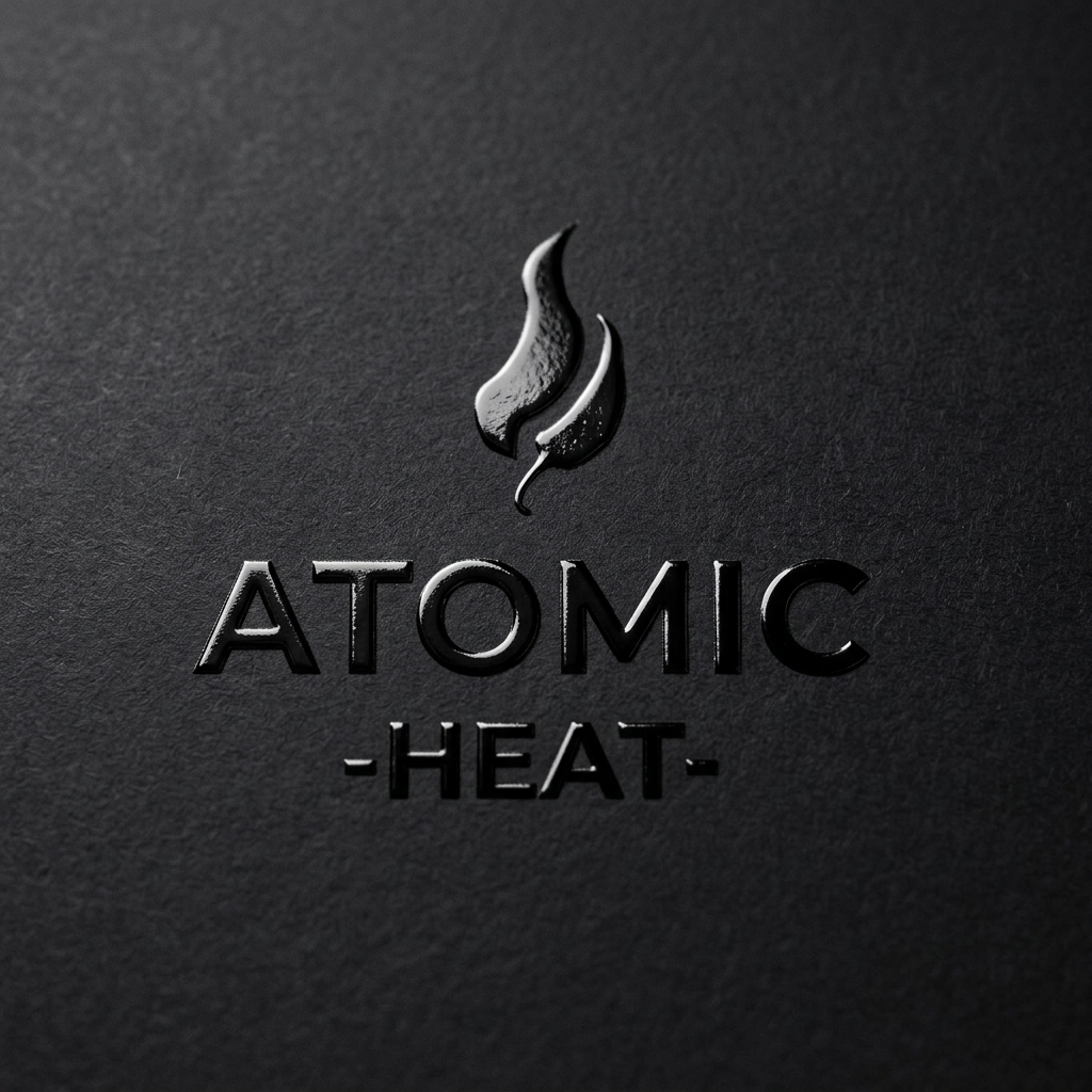
Atomic Heat is a luxury, science-inspired hot sauce brand built around three modern, cylindrical bottles with a bold flame‑pepper logo and masculine, minimal typography. The packaging uses die cuts so the sauces’ own colors activate the design.
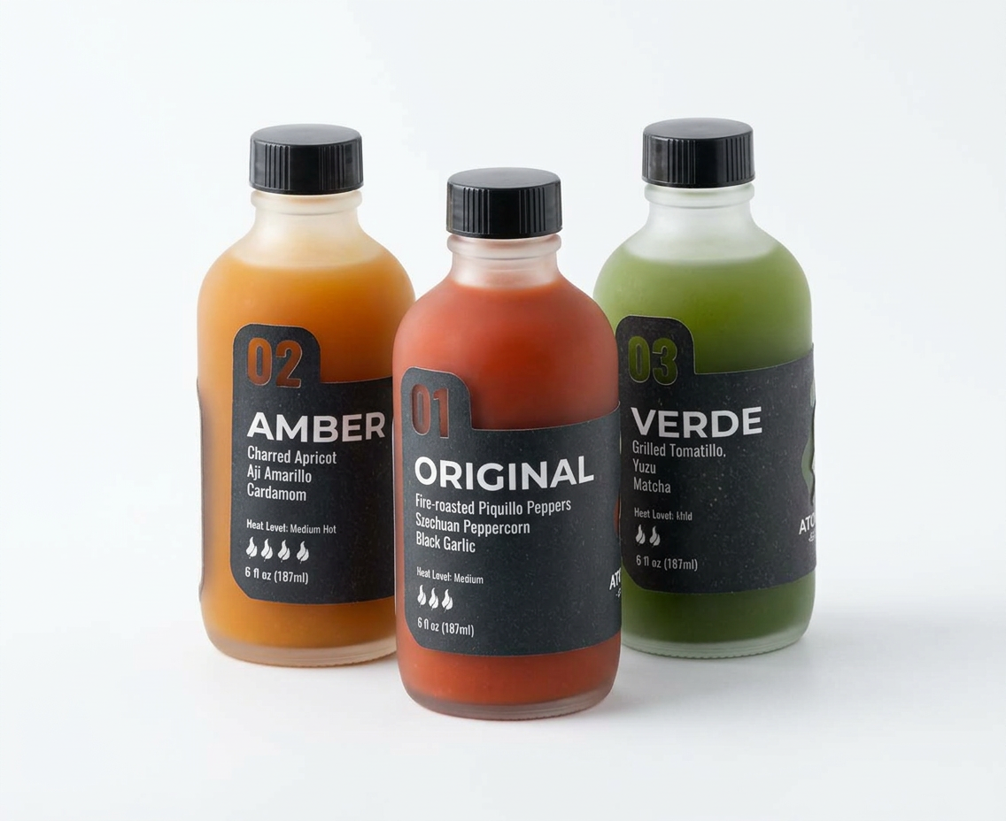
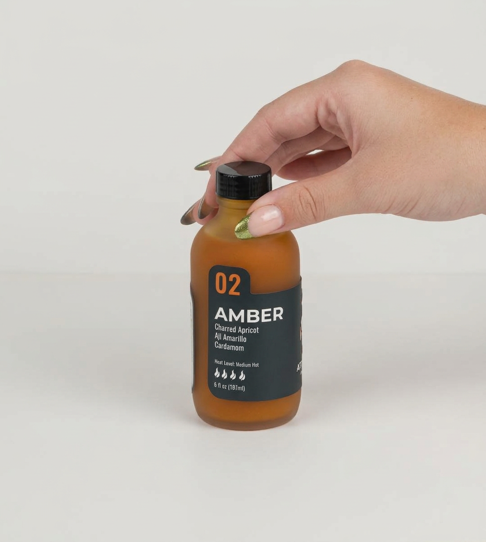
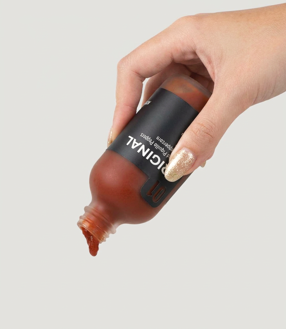
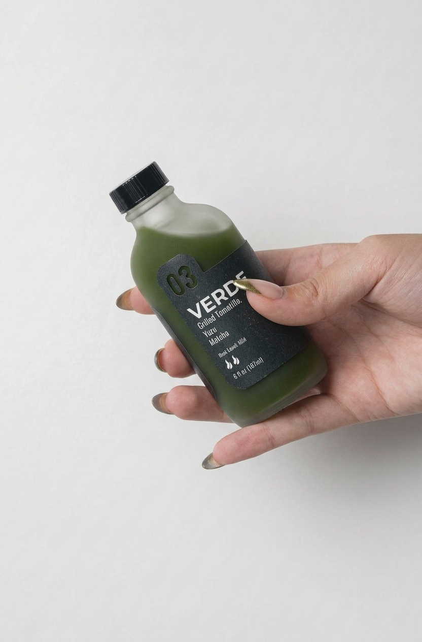
Atomic Heat’s identity combines a sleek wordmark and stylized flame‑pepper icon to signal intensity and precision while still feeling refined and giftable. Each of the three flavors is numbered and differentiated through name, heat level, and sauce color, creating a system that feels almost lab-coded without losing warmth. The dark wrap with crisp white type and strategic die cuts lets the liquid color come forward, so the product itself becomes a key visual element and reinforces the brand’s modern, experimental attitude.
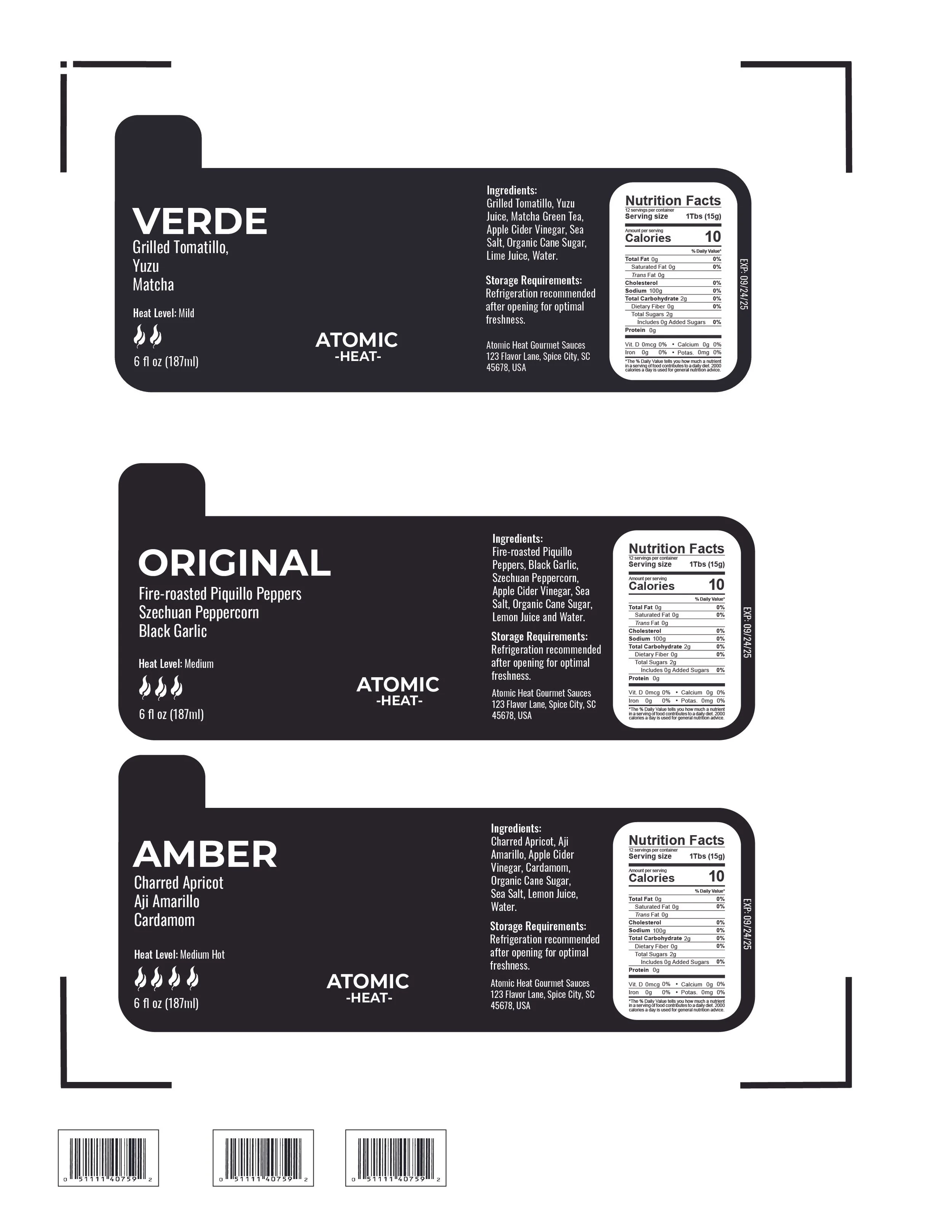
The project began with the ambition to house the sauces in fully spherical packaging to echo the “atomic” concept, but production and wrapping limitations made that form unrealistic at this scale. Pivoting to cylindrical bottles, I refined the logo, type hierarchy, and label grid to keep the design feeling technical and focused, then iterated die-cut shapes and placements so the revealed text remained legible while showcasing the sauce color. That prototyping phase—testing materials, alignments, and how the bottles read together as a set—ultimately clarified the system and aligned the final solution with both the concept and practical constraints.
Atomic Heat emerges as a tight, premium brand that visually communicates controlled intensity and experimentation through its restrained identity and tactile, color-driven packaging system.
Thank you for viewing.